Hanna Le
BRIGHTSPACE
BrightSpace is the Toronto District School Board Online Learning Platform managed by DL2
PROJECT OVERVIEW
This is a real-life independent case study, where I was trying to figure out why students and teachers were complaining that they were having many problems using the new online platform since most classrooms have moved online due to the pandemic. I wanted to investigate what the issues were and if there were any solutions to solve them.
PROJECT TYPE
Re-Design existing web platform
TOOL USED
Adobe XD
PROTOTYPE LINK
PROCESS
-
Interview users: Teachers, Students & Parents
-
Conduct a survey to collect qualitative and quantitative data
-
Understand users through empathy mapping and persona
-
Find the problems with the current designs
-
Define possible solutions
-
Wireframe & Prototype
-
Usability test
Give it a few seconds to load...
You can interact with the image. Go ahead try it out!
Empathy mapping
trying to understand the users' points of view

-
Teachers
-
Students
-
Parents
-
All
User Persona
Focusing on students since they have the highest participation rate in this study

WireFrames
Improving the site functionality by using layouts that maximize usage of space while maintaining its esthetic look

Prototype
The prototype focused on where the improvements are needed, not the entire website

REDESIGNING TO IMPROVE CURRENT ISSUES
CURRENT DESIGN & PROBLEMS
The entire main page was just for log-in and it has confusing multiple students' log-in slots, and there was no link to access help or get additional information.

RE-DESIGNED:
Main Page has additional information and clearer sign-ins

BEFORE:
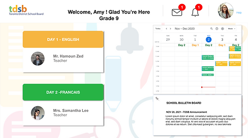
Confusing multiple ways to do just getting into the class home page and the screen is mostly empty, wasting space. Students have to click on it multiple times to get where they want to be.

SOLUTION:
Students can see their classes while also checking their schedules and see the announcement on the home page without too much clutter. They don't have to click multiple times to see the information or to get where they want to be.

BEFORE:
The logins were completely different. Even the logos were so different they look like from two separate companies.


SOLUTION: Login screens should be the same across the TDSB's website
DESIGNS BEFORE AND AFTER
CONFUSING MAIN PAGE
The entire main page was just for log-in and it has confusing multiple students' log-in slots, and there was no link to access help or get additional information.

RE-DESIGNED
Added important information with clearer sign-ins, and the "Help" option for support.

INCONSISTENT LOG-IN
The logins were completely different. Even the logos were so different they look like from two separate companies.


SOLUTION
Login screens should be the same across the TDSB's website

WHY AN EMPTY PAGE JUST FOR ONE FUNCTION?
Once the students log in this is what they see. An empty page just so that they can select their classes.

SOLUTION
The first page is redesigned and organized so that the class information is clear and easy to understand. In addition, the class schedule and announcement are right on the main page, saving students time and clicks.
CONFUSING ICONS & PAGE FUNCTIONALITY
The course main page is not useful, and students are confused with the use of similar icons for completely different functions. They don't know where to go for their Sync classes and can't find their assignments.

SOLUTION
The course pages functionality can be improved by changing the icons and reorganizing them in a way that students can easily access their course information such as schedule, assignments, and grades


Reflection
I find users research and usability testings are the two most essential processes in product design and can not be skip. Qualitative and quantitative data are helpful when it comes to knowing who our users are. At the same time, usability testing can help us understand our users' behaviours, find our design flaws and make improvements based on our findings. For example, students' ages can make a difference in how they use the user interface; therefore, our design strategy must match each age category.


